Beacon Care

Things I did
Product design
Dashboard UI
Accessibility
Client
Self-initiated
Year
2026
Platform
Clinician web dashboard, patient app

Recovery at home, watched over. I designed a nurse dashboard that puts the patients who need attention first, and a two-minute daily check-in for patients. All patients shown are fictional.

The challenge

More patients now recover at home after surgery. A nurse following dozens of them needs to know, every morning, who to call first, and patients, many of them older, need a check-in they can finish in two minutes.

The approach

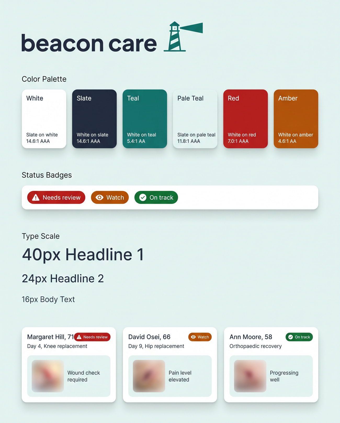
I designed the nurse view as a list sorted by need, not a wall of charts. The patient app uses large type, one question per screen and plain words, designed to WCAG 2.2 AA. Alert limits are set by the care team; the product never diagnoses.
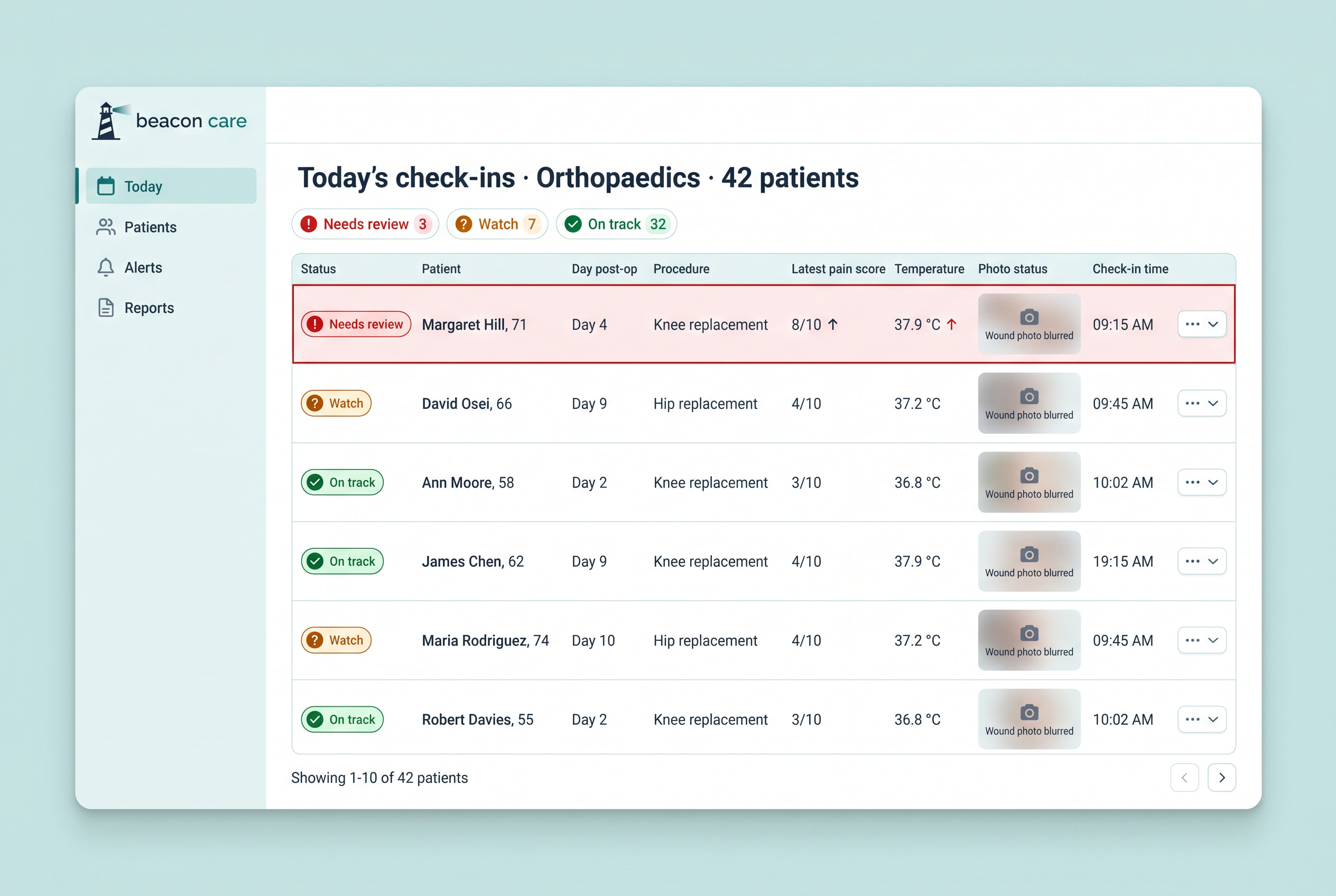
Who needs a call first
Nurse view

Who needs a call first

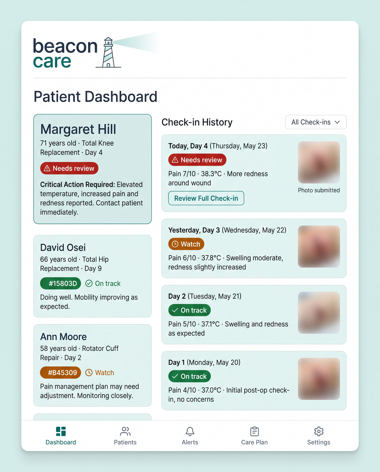
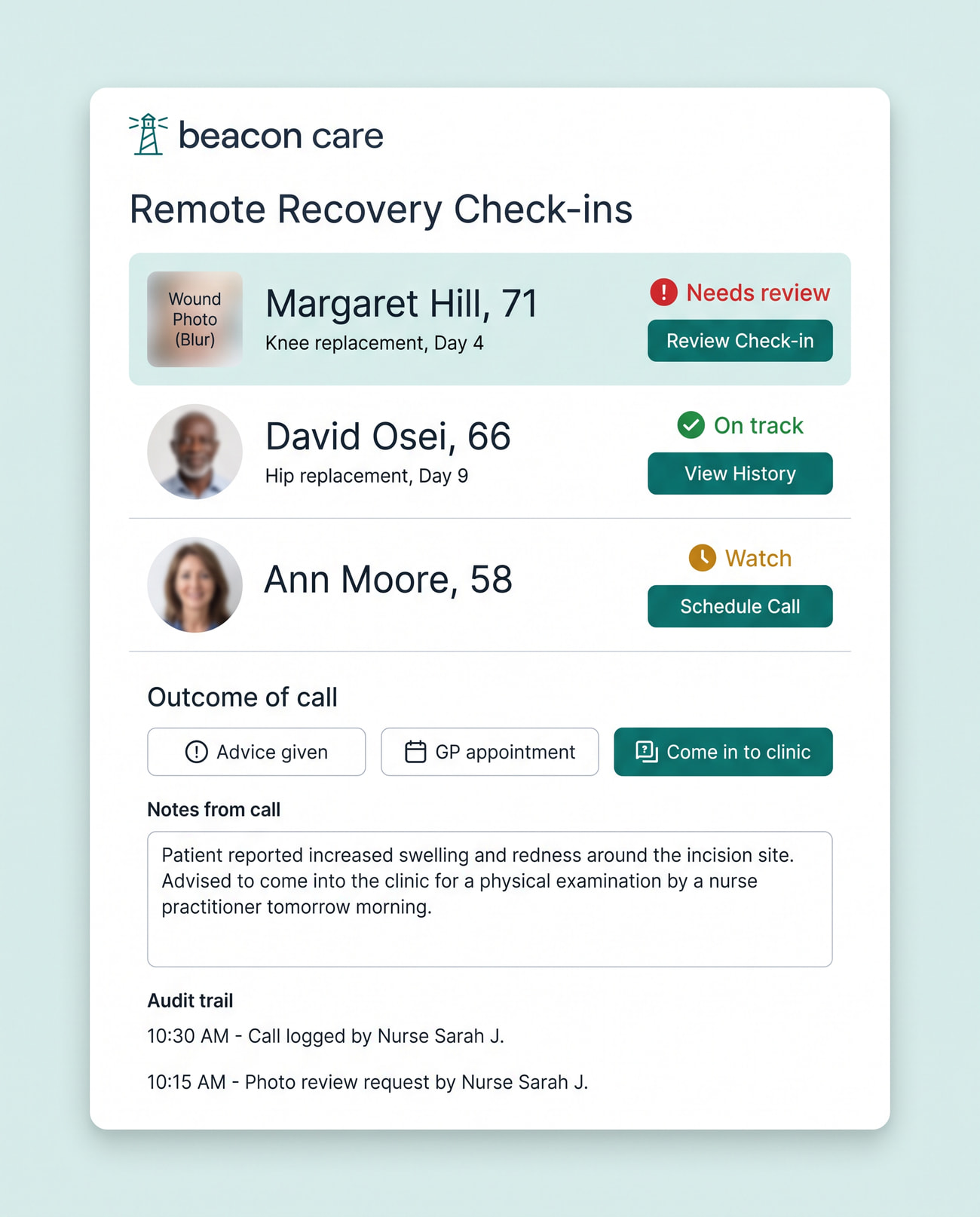
Every morning the list is sorted by who needs attention, and every row says why in words: "Temperature 38.3°C, pain up from 4 to 7." Nurses scan reasons, not charts.
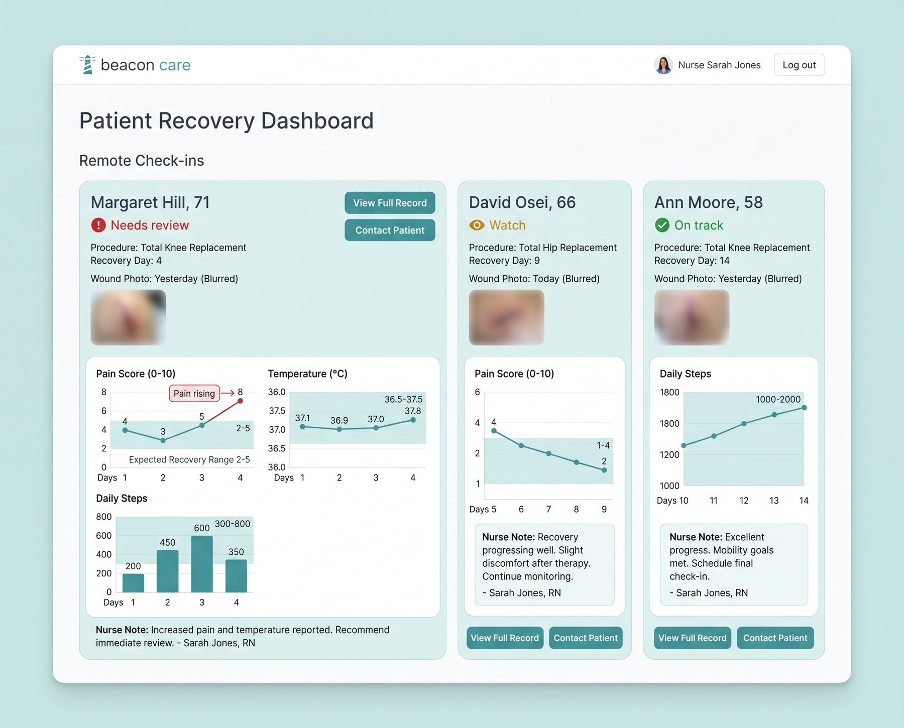
A recovery on one page
Alerts marked on the line
Patient detail

A recovery on one page

A patient's page shows their recovery since they went home, with the readings that raised an alert marked on the line. Check-ins and wound photos sit in a timeline, so a change is easy to spot.
Nothing left half-done
Alerts

Nothing left half-done

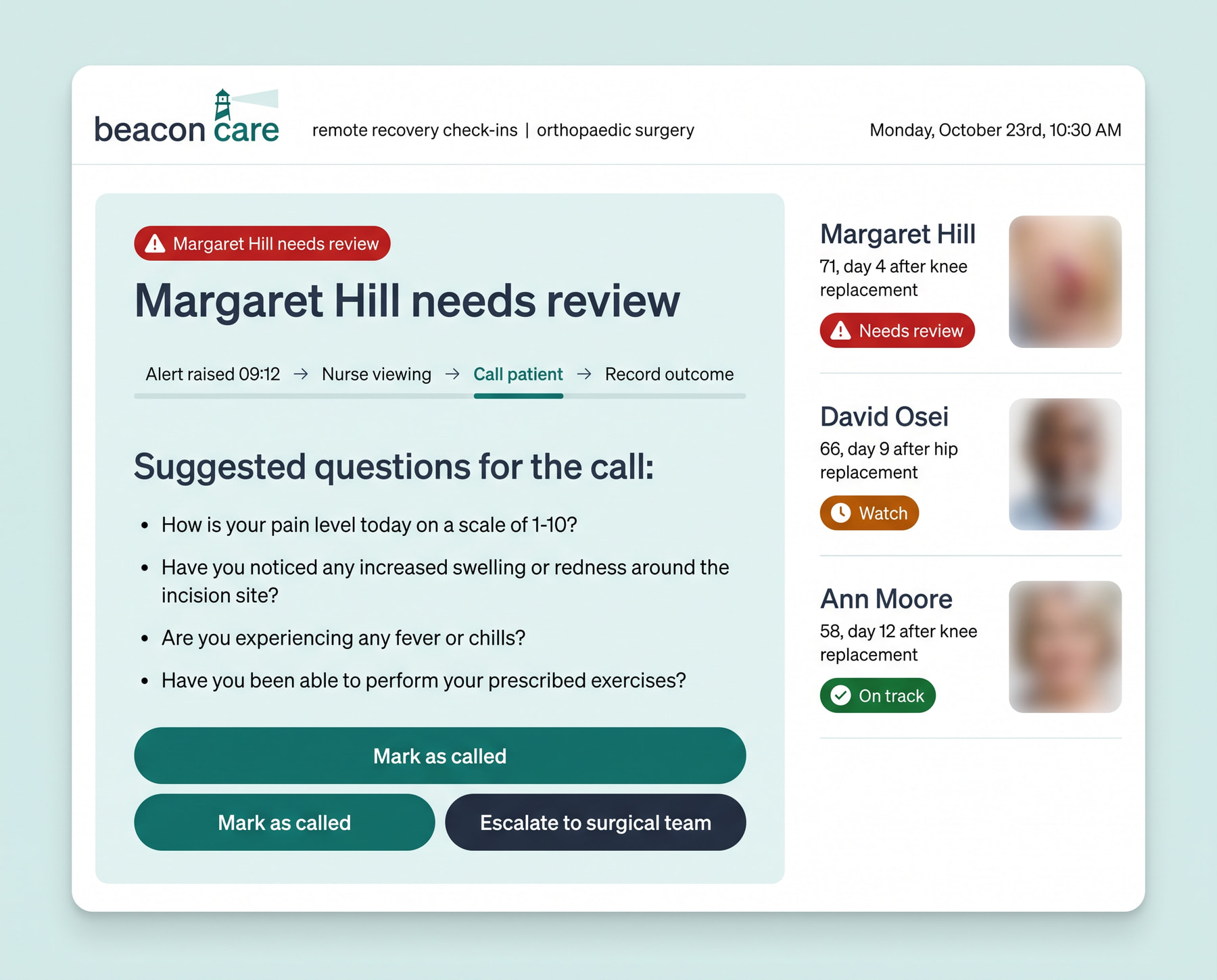
When a reading crosses a limit set by the care team, the alert walks the nurse through the steps: acknowledge, call, record the outcome. An alert can't close until the outcome is written down.
Daily check-in

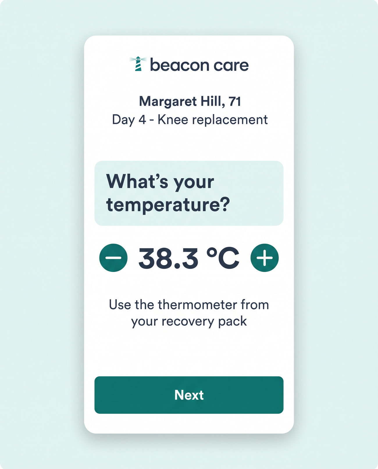
Two minutes, one question at a time

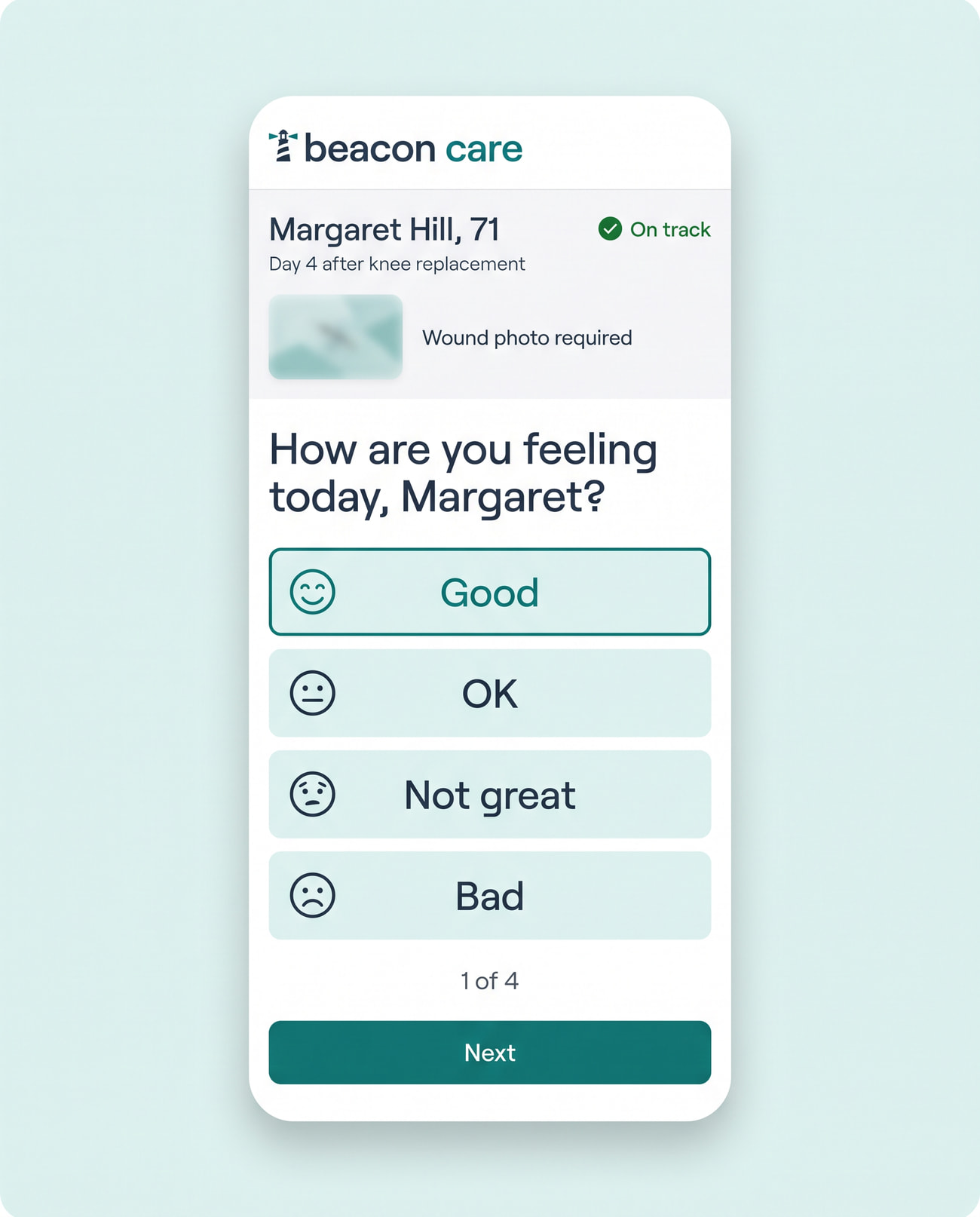
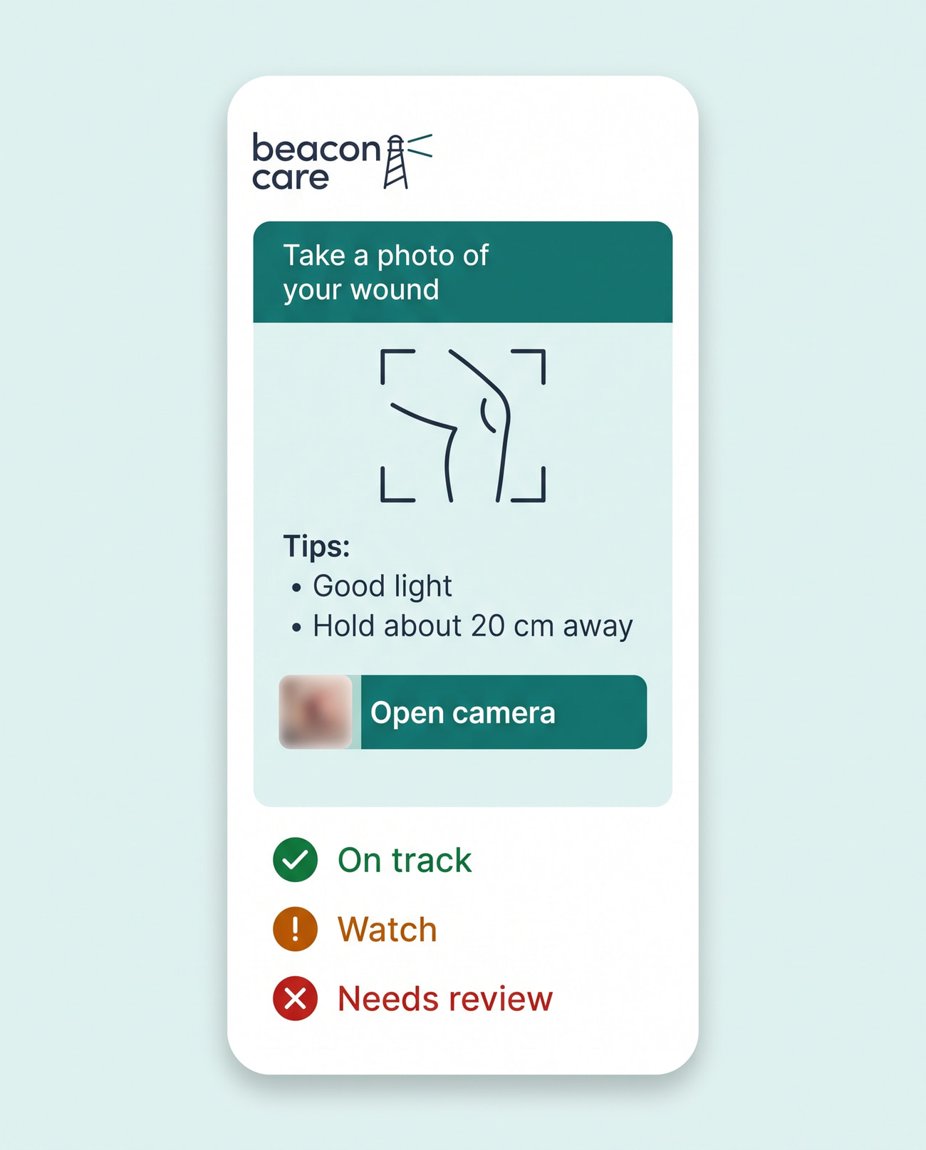
The check-in asks one question per screen, with large buttons and plain words. It's designed to work with a screen reader and at 200% text size, because many patients are older and still recovering.
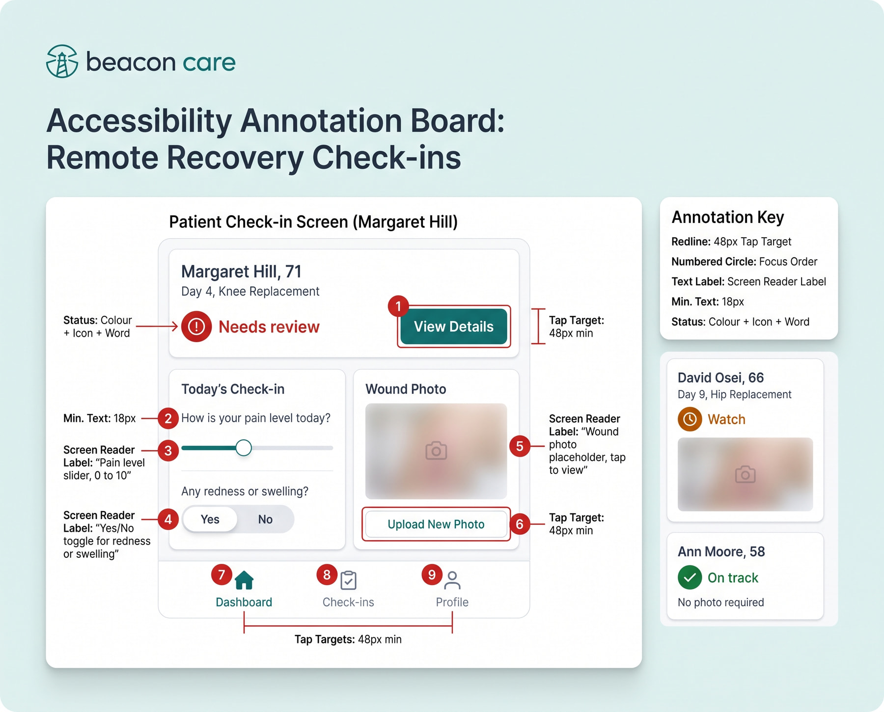
Accessibility written into the file
Designed to WCAG 2.2 AA
Accessibility

Accessibility written into the file

Accessibility notes are part of the design, not an afterthought: contrast ratios, focus order, screen reader labels and 48-pixel touch targets on every patient screen.
The shift change, on one page
Handover

The shift change, on one page

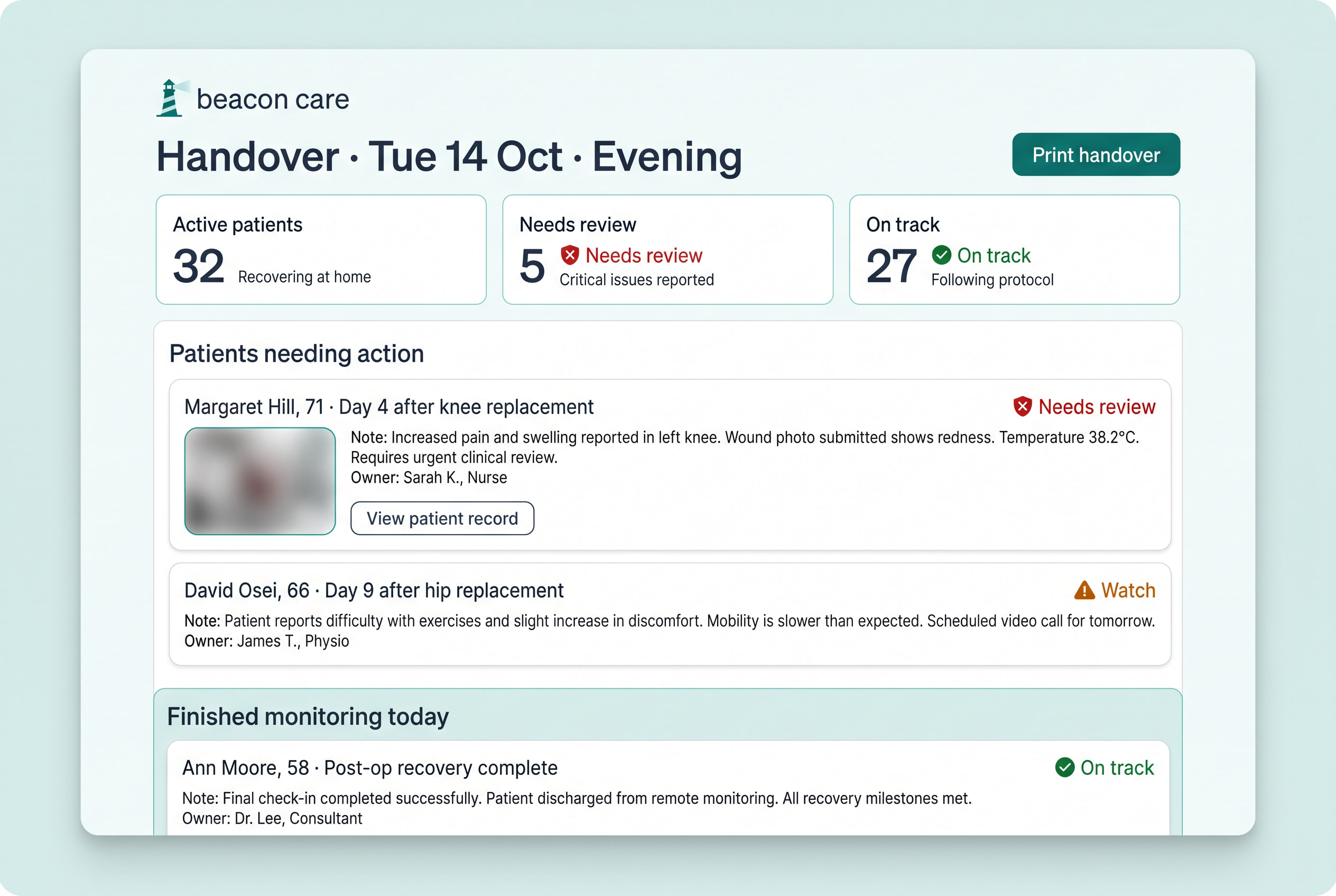
At the end of a shift, the handover lists who still needs action, who owns it and who finished monitoring today, so nothing is lost between nurses.
WCAG 2.2 contrast target on every screen
AA
Minimum touch target in the patient app
48 px
Target length of the daily check-in
2 min

Building something like this?

I design and build SaaS products and marketing sites for growing tech companies. Tell me what you're working on.
Let's talk
More
work